

Getting Started
In this series, our goal is to learn the basics of Figma, learning through the creation of our first real elements, being buttons. If you have not already, I would recommend that you read the first article of this series which walks through the steps of properly setting up a Figma project and a basic walkthrough of the most common tools in the application.
First Steps
The first steps for this guide are the same as for any Figma project. First, open the Figma application, open the previously created project (or create a new one if you did not follow the first guide). We will then create two new frames for our project, once again selecting the size of iPhone 11 Pro / X. We will then rename the frames, giving them the title of "Sign In" and "Loadup".
Gathering Image/Icon Resources
The first step for creating these screens will be to gather all of the required icons and image assets that we will be using for this project. These include the following:
Download all of the required assets, and move them to a folder where you can access them easily, as we will be making use of them in the next section.
The Design
We will now begin designing the elements that will live on the page individually, and we will bring them together at the end on each of our two empty frames.
Notable New Features
Before we begin, we will be using the following features in this walkthrough that have not yet been mentioned in previous guides:
- Groups - Groups allow you to select multiple elements at once, and move/manipulate them as a unit.
Creating the Buttons
Our first order of business will be to create all of the buttons that will be placed on the page. We will do them in order, step by step, until all 4 have been created.
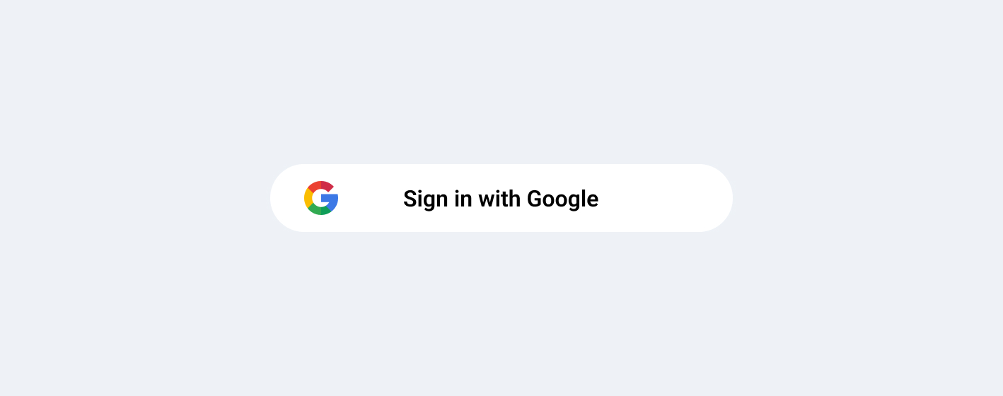
Login with Google
- Create a new rectangle using the shape tool with the dimensions 327px x 48px
- Give the rectangle a white fill (#FFFFFF)
- Change the rectangle's corners to have a 100 pixel radius
- Add the Google logo to the left corner of the rectangle with the dimensions 24px by 24px
- Add centered text to the middle of the rectangle (text size: 16px; font: Roboto)
- Change the text color to Gray (#74757A)
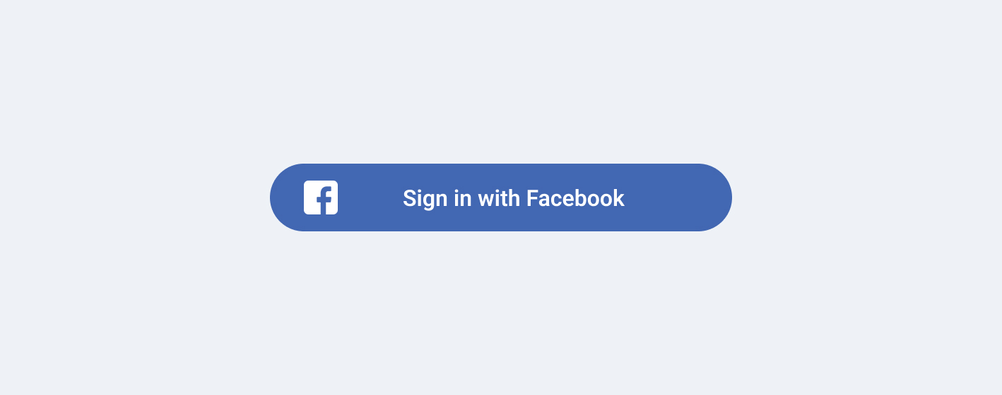
Login with Facebook
- Create a new rectangle using the shape tool with the dimensions 327px x 48px
- Give the rectangle a Facebook blue fill (#4267B2)
- Change the rectangle's corners to have a 100 pixel radius
- Add the Facebook logo to the left corner of the rectangle with the dimensions 24px by 24px
- Add centered text to the middle of the rectangle (text size: 16px; font: Roboto)
- Change the text color to White (#FFFFFF)
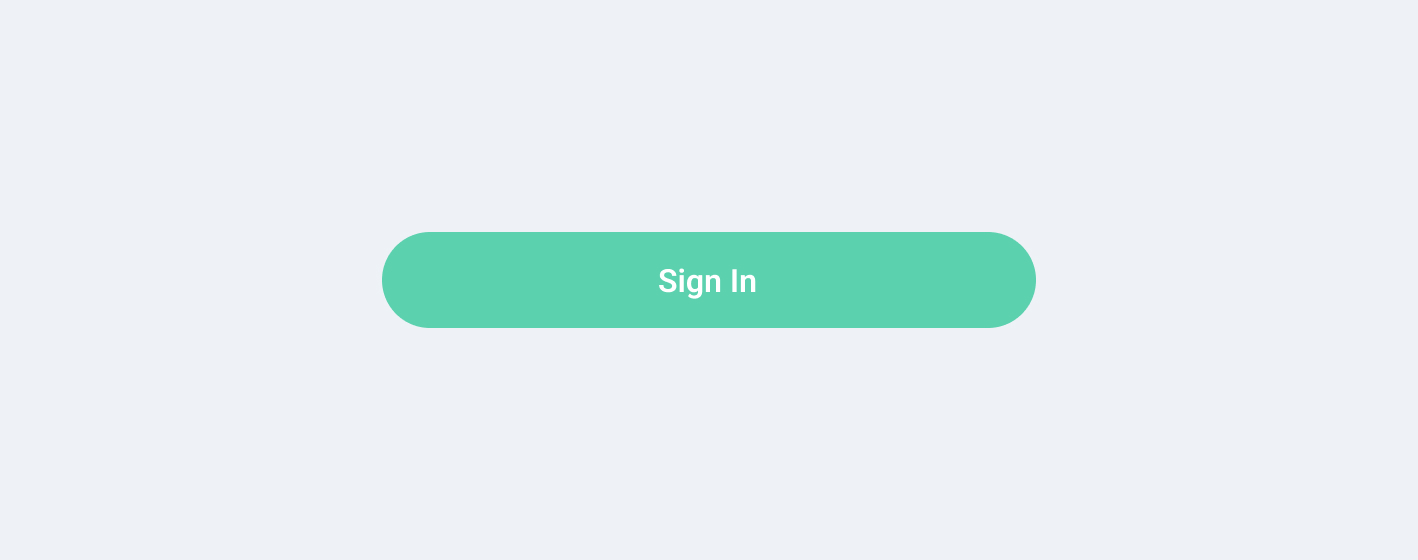
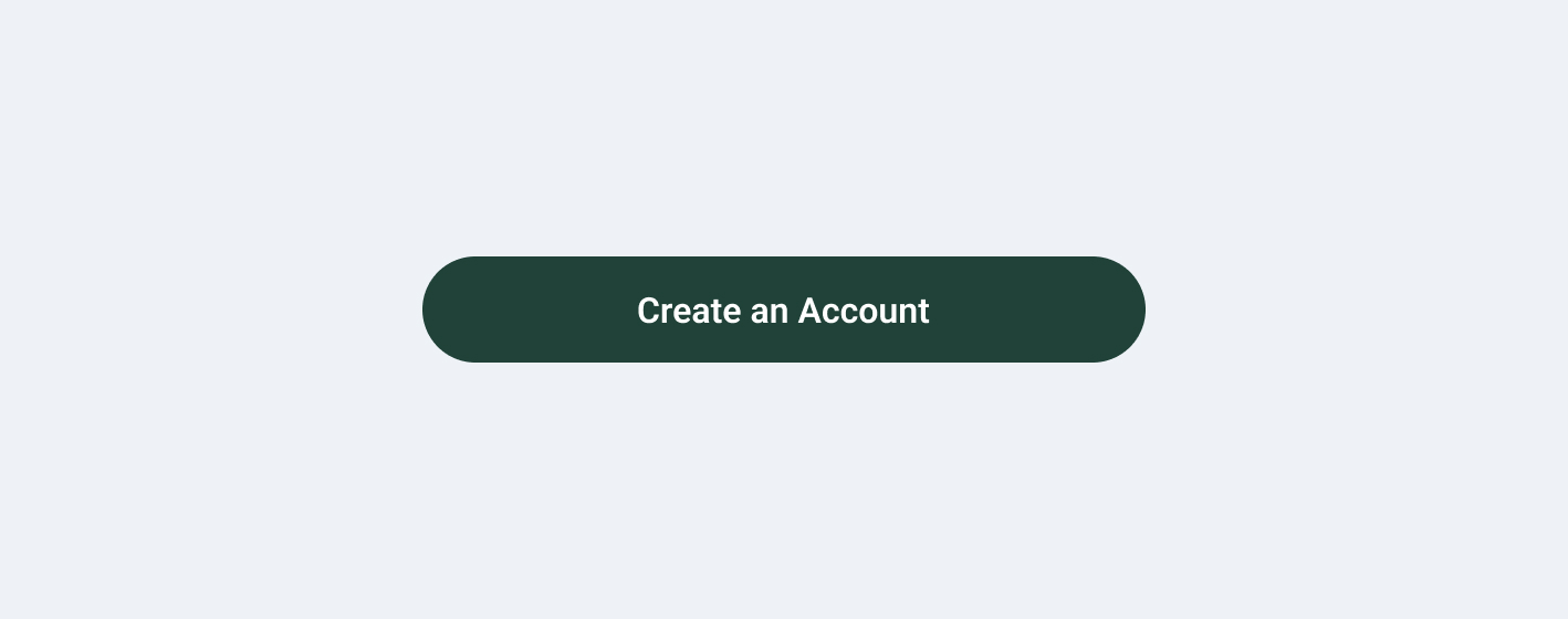
Log In (Standard)
- Create a new rectangle using the shape tool with the dimensions 327px x 48px
- Give the rectangle a fill of your choosing that matches the "Splash" frame's background
- Change the rectangle's corners to have a 100 pixel radius
- Add centered text to the middle of the rectangle (text size: 16px; font: Roboto)
- Change the text color to White (#FFFFFF)
Sign Up (Standard)
- Create a new rectangle using the shape tool with the dimensions 327px x 48px
- Give the rectangle a gray fill (#74757A)
- Change the rectangle's corners to have a 100 pixel radius
- Add centered text to the middle of the rectangle (text size: 16px; font: Roboto)
- Change the text color to White (#FFFFFF)
Wrapping Up Buttons
To finish up the buttons, we will be grouping each of the four buttons for ease of use. To group two elements, drag your mouse to select both elements at the same time. You then can do one of two things:
- Go to the top menu bar, and select Object > Group Selection
- Simply press "⌘ + G" on Macs or "Ctrl + G" on Windows
With that, youre all done with buttons!